Next time you flip the switch, turn the dial, or clap your hands to turn on the light, think about the origin of electricity. Where does electricity come from? If you took it upon yourself to seek the truth via Google or if the answer was a no-brainer, then pat yourself on the back because some people believe that electricity comes from the wall. Blogger may be the wrong social medium, but #literallynotjoking #knowledgeispower #justsayin
The condensed answer: electricity can be derived from a variety of energy sources. Commonly, power plants in the United States burn coal, oil, and natural gas (fossil fuels). The combustion of fossil fuels causes an exothermic chemical reaction to release heat. A boiler converts this heat energy into high-pressure steam for turbines to create mechanical energy. Finally, generators use the mechanical energy to produce electrical energy.
Around this time last year, while I was conquering the final academic semester, one of my professors offered me the opportunity to initiate a challenge. Along with my fellow colleagues, we developed the first student-derived, student-taught, general education course at James Madison University. I'm not an expert of energy, but I am a proud graduate of JMU who believes in sustainability and pursues environmental stewardship. Read about me and my green friends --> ISAT students to teach class challenging their peers to save energy.
21 February 2013
26 January 2013
the worthiness of being random.
Hello world!
Today I was asked to explain the meaning of randomness in statistics. The textbook definition that my brain forced out of my mouth reinforced that I know why. Although the question was answered precisely, the lack of understanding why didn't sit too well with my inquisitive nature. Instead of just knowing, I love the satisfaction of understanding things! So why is randomness important to understand in statistics?
In statistics, random selection is crucial because it's like a shield that protects us from unwanted biases or influences. Before the cards are dealt for a nice game of Go Fish, the deck is shuffled so that no player can guess which cards they'll receive. Don't like Go Fish? Think of the lottery! We know the possible values that may be picked, but they are randomly picked so that no player has an advantage. Randomness is essential and most important to keep things fair. I came across an awesome quote from a post titled Random Thoughts on Stats Made Easy.
Designing an experiment is like gambling with the devil: only a random strategy can defeat all his betting systems. -- R.A. Fisher
22 January 2013
true words.
Nothing in all the world is more dangerous than sincere ignorance and conscientious stupidity.I'm a bit late with this post, but these words spoken by Dr. Martin Luther King, Jr. will always be relevant. As a national icon in our history, King led the African-American Civil Rights Movement and fought for what is right.
He supported equality among people and promoted nonviolent civil disobedience. Dr. Martin Luther King, Jr. was a great man and we have him to thank for the progress we've made towards equality and a better world.
I love this quote because it's a beautiful reminder that we must continuously improve ourselves. Whether it is learning in class, or at a job, or about yourself and others, learning is a life-long process that can only improve the quality of life.
15 December 2012
almost there.
It's 10:30PM on a Saturday night, what are you doing?
Well, I have no shame in saying that I'm sitting in the computer lab of my school's library working on this post. There's two other students in the lab so whatever haha... Here are some highlights and personal improvements since the last post!
In August, I started to look for my first real-world job. There's been many ups and downs, but I definitely learned a lot about myself. What doesn't kill you makes you stronger, right? After applying to about 80 different positions, I only had two interviews! The phone interviews were both for companies that I'd only dream to work for. I completely bombed the first one with a bunch of "likes, ands, and umms." I feel embarrassed just thinking about the second phone interview... Finally, I felt exhausted and fed up with myself.
Before the final presentation of my senior thesis, my advisor gave me some advice to combat the nervousness. "Think of it as acting. You're just an actor on stage and the thesis is your script." BAMMM! I took the advice and survived; there are other reasons how I survived the situation but that's another story. I used the same advice for another phone interview and it went surprisingly well! The company was excited to hear more. There was suppose to be another preliminary phone interview, but that was bypassed and I was scheduled to meet them in person!
The day of my first in-person interview. I made sure to conserve my mental energy by planning everything I had to do the night before. During the morning of the interview, I woke up and followed my schedule but I noticed one huge difference. Everything just seemed to go according to plan! This never happens. I can only thank Dr. Radziwill for the Politically Incorrect Secrets for Getting Through College!! The Law of Attraction has gained another believer. I promised to just be myself and to encompass myself with positivity. Anyways, I strolled into the office like a boss and blew the interview out of the water!
My room is not usually clean. I try cleaning my room often but I don't clean my entire room because... I slightly like to hoard. At least I admit to it! I cleaned my room and rearranged everything to improve the Feng Shui. As a kid with a superstitious asian mom, I know all the rules and configurations for the best Feng Shui. It may be coincidence, but I absorbed all the good energy and actually enjoyed waiting on tables. All the good energy must have rubbed off on my tables because I made over 25% of my total sales!
.JPG)
Well, I have no shame in saying that I'm sitting in the computer lab of my school's library working on this post. There's two other students in the lab so whatever haha... Here are some highlights and personal improvements since the last post!
10 December 2012: I (somewhat) pretended to be someone else.
In August, I started to look for my first real-world job. There's been many ups and downs, but I definitely learned a lot about myself. What doesn't kill you makes you stronger, right? After applying to about 80 different positions, I only had two interviews! The phone interviews were both for companies that I'd only dream to work for. I completely bombed the first one with a bunch of "likes, ands, and umms." I feel embarrassed just thinking about the second phone interview... Finally, I felt exhausted and fed up with myself.
Before the final presentation of my senior thesis, my advisor gave me some advice to combat the nervousness. "Think of it as acting. You're just an actor on stage and the thesis is your script." BAMMM! I took the advice and survived; there are other reasons how I survived the situation but that's another story. I used the same advice for another phone interview and it went surprisingly well! The company was excited to hear more. There was suppose to be another preliminary phone interview, but that was bypassed and I was scheduled to meet them in person!
13 December 2012: I promised myself to just be me.
The day of my first in-person interview. I made sure to conserve my mental energy by planning everything I had to do the night before. During the morning of the interview, I woke up and followed my schedule but I noticed one huge difference. Everything just seemed to go according to plan! This never happens. I can only thank Dr. Radziwill for the Politically Incorrect Secrets for Getting Through College!! The Law of Attraction has gained another believer. I promised to just be myself and to encompass myself with positivity. Anyways, I strolled into the office like a boss and blew the interview out of the water!
14 December 2012: I cleaned my room.
My room is not usually clean. I try cleaning my room often but I don't clean my entire room because... I slightly like to hoard. At least I admit to it! I cleaned my room and rearranged everything to improve the Feng Shui. As a kid with a superstitious asian mom, I know all the rules and configurations for the best Feng Shui. It may be coincidence, but I absorbed all the good energy and actually enjoyed waiting on tables. All the good energy must have rubbed off on my tables because I made over 25% of my total sales!
.JPG)
07 December 2012
the end of the world.
One of the coolest people I know has introduced an interesting challenge, The December 2012 End of the World Improvement Challenge. I accept! It's for the greater good so I suggest that you accept the challenge because it's never too late.
So... the world is apparently going to end on December 21, 2012. What are your thoughts? I realized that I'm too involved with a bunch of other things that I don't give it much thought. However, thanks to Dr. Radziwill, I like all things quality and self-improvement is a way to improve the quality of me! Anyways, let's get in the habit of improving at least one thing a day between now and the much hyped "end of the world." How do I improve? What do I improve? Where do I start? These answers are up to you. When it comes to self-improvement, there's no right or wrong way to achieve success as long as it is right for you. This improvement challenge is not limited to yourself. You can help someone else improve something as long as you or that someone feels good/better.
How will you improve something today?
04 December 2012
the pareto principle: the vital few and trivial many.
Hello! I've always known December to be cold and dark because I grew up in New York, but the Virginia weather is stunning today and I'm loving it!!
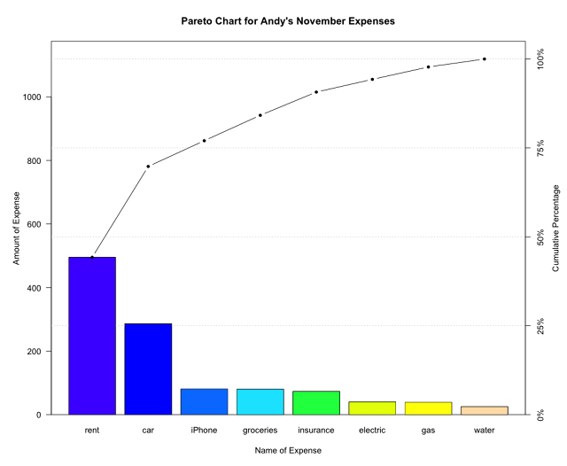
Today, I'd like to talk about the Pareto Principle. The Pareto Principle, also known as the 80/20 Rule, states that about 80% of effects come from 20% of causes. My simple explanation is that 80% of the trouble comes from 20% of the problems. To apply this principle during analysis, the Pareto Chart is used to determine the "vital few"causes that are responsible for the majority of defects. The Pareto Chart is a type of bar graph. Each bar displays the frequency of occurrences in a certain category and is organized from the greatest (left) to the least (right).
The Pareto Chart is one of the Seven Basic Quality Tools and I'm going to show you how I analyzed my expenses from November in R! If you'd like to follow along, download the current version of R: 2.15.2 "Trick or Treat." You'll also need to install the "qcc" package in order to create the chart.
1. I created a vector named "expenses" that contains the cost of each expense I paid in November.
> expenses <- c(495, 286, 81, 80, 73, 39, 40, 25)
2. Next, I categorized or named each expense with the names() function. Note: the names must be in the same order you listed for costs.
> names(expenses) <- c("rent", "car"," phone", "groceries", "insurance", "gas", "electric", "water")
Use the data.frame() function if you prefer to work with a data frame. I'll name mine "df.expenses"
> df.expenses <- data.frame(expenses)
Print the vector (expenses) and the data frame (df.expenses) to see how the data is displayed.
> expenses
rent car iPhone groceries insurance gas electric water
495 286 81 80 73 39 40 25
> df.expenses expensesrent 495car 286iPhone 81groceries 80insurance 73gas 39electric 40water 25
3. Now we use the library() function to load the "qcc" package and create the Pareto Chart.
> library(qcc)
Loading required package: MASS
Package 'qcc', version 2.2
Type 'citation("qcc")' for citing this R package in publications.
> pareto.chart(expenses)
Pareto chart analysis for expenses
Frequency Cum.Freq. Percentage Cum.Percent.
rent 495.000000 495.000000 44.235925 44.235925
car 286.000000 781.000000 25.558534 69.794459
iPhone 81.000000 862.000000 7.238606 77.033065
groceries 80.000000 942.000000 7.149240 84.182306
insurance 73.000000 1015.000000 6.523682 90.705987
electric 40.000000 1055.000000 3.574620 94.280608
gas 39.000000 1094.000000 3.485255 97.765862
water 25.000000 1119.000000 2.234138 100.000000
 (Above) By default, the pareto.chart() function shows a Pareto analysis and the corresponding chart. Let's add some labels and spice it up!
> pareto.chart(expenses,main="Pareto Chart for Andy's November Expenses",xlab="Name of Expense",ylab="Amount of Expense",las=1,col=topo.colors(8))
 Here is a list of the arguments I used and what they mean:
- main: title for Pareto Chart
- xlab: x-axis label
- ylab: y-axis label
- las: orientation of labels on axes (1=horizontal, 2=vertical, 3= perpendicular to axes)
- col=type(length(expenses)): if you don't like the cool tones of topo.colors palette, replace the type with heat.colors for warm tones, terrain.colors for earthy tones, or rainbow for ROYGBIV colors
4. To make it easier for analysis, I added a horizontal line at 80% to see which expenses were problematic for in November.
> abline(h=(sum(expenses)*0.80),col="red",lwd=4)
R calls lines "A-B lines" so we use the abline() function. The h stands for horizontal. This horizontal line is equal to the sum of my expenses multiplied by 0.80. By default, the line width is set to 1 and the color is black but I used the col and lwd arguments for a red colored line and a thicker line width of 4.
 5. There's my final product! The major contributors of November's expenses were rent and car! In other words, my rent and car account for the majority of my expenses (80% of problems). Also, I should focus my efforts on these two expenses for the greatest improvement -- note to self: find a place with cheaper rent and/or sell my car for a bicycle!
The Pareto Principle states that about 80% of effects come from 20% of causes. The chart illustrates the small number of causes that account for most of the problems. Remember, the Pareto Chart can only be used when your data are broken into categories with the corresponding frequency of occurrences.
Today, I'd like to talk about the Pareto Principle. The Pareto Principle, also known as the 80/20 Rule, states that about 80% of effects come from 20% of causes. My simple explanation is that 80% of the trouble comes from 20% of the problems. To apply this principle during analysis, the Pareto Chart is used to determine the "vital few"causes that are responsible for the majority of defects. The Pareto Chart is a type of bar graph. Each bar displays the frequency of occurrences in a certain category and is organized from the greatest (left) to the least (right).
The Pareto Chart is one of the Seven Basic Quality Tools and I'm going to show you how I analyzed my expenses from November in R! If you'd like to follow along, download the current version of R: 2.15.2 "Trick or Treat." You'll also need to install the "qcc" package in order to create the chart.
1. I created a vector named "expenses" that contains the cost of each expense I paid in November.
> expenses <- c(495, 286, 81, 80, 73, 39, 40, 25)
2. Next, I categorized or named each expense with the names() function. Note: the names must be in the same order you listed for costs.
> names(expenses) <- c("rent", "car"," phone", "groceries", "insurance", "gas", "electric", "water")
Use the data.frame() function if you prefer to work with a data frame. I'll name mine "df.expenses"
> df.expenses <- data.frame(expenses)
Print the vector (expenses) and the data frame (df.expenses) to see how the data is displayed.
> expenses
rent car iPhone groceries insurance gas electric water
495 286 81 80 73 39 40 25
> df.expenses expensesrent 495car 286iPhone 81groceries 80insurance 73gas 39electric 40water 25
3. Now we use the library() function to load the "qcc" package and create the Pareto Chart.
> library(qcc)
Loading required package: MASS
Package 'qcc', version 2.2
Type 'citation("qcc")' for citing this R package in publications.
> pareto.chart(expenses)
Pareto chart analysis for expenses
Frequency Cum.Freq. Percentage Cum.Percent.
rent 495.000000 495.000000 44.235925 44.235925
car 286.000000 781.000000 25.558534 69.794459
iPhone 81.000000 862.000000 7.238606 77.033065
groceries 80.000000 942.000000 7.149240 84.182306
insurance 73.000000 1015.000000 6.523682 90.705987
electric 40.000000 1055.000000 3.574620 94.280608
gas 39.000000 1094.000000 3.485255 97.765862
water 25.000000 1119.000000 2.234138 100.000000

> pareto.chart(expenses,main="Pareto Chart for Andy's November Expenses",xlab="Name of Expense",ylab="Amount of Expense",las=1,col=topo.colors(8))

- main: title for Pareto Chart
- xlab: x-axis label
- ylab: y-axis label
- las: orientation of labels on axes (1=horizontal, 2=vertical, 3= perpendicular to axes)
- col=type(length(expenses)): if you don't like the cool tones of topo.colors palette, replace the type with heat.colors for warm tones, terrain.colors for earthy tones, or rainbow for ROYGBIV colors
4. To make it easier for analysis, I added a horizontal line at 80% to see which expenses were problematic for in November.
> abline(h=(sum(expenses)*0.80),col="red",lwd=4)
R calls lines "A-B lines" so we use the abline() function. The h stands for horizontal. This horizontal line is equal to the sum of my expenses multiplied by 0.80. By default, the line width is set to 1 and the color is black but I used the col and lwd arguments for a red colored line and a thicker line width of 4.

The Pareto Principle states that about 80% of effects come from 20% of causes. The chart illustrates the small number of causes that account for most of the problems. Remember, the Pareto Chart can only be used when your data are broken into categories with the corresponding frequency of occurrences.
28 November 2012
how to summarize data.
Hi! I hope everyone had a great time with family and friends last week. I'm very thankful that I got to spend the week relaxing and seeing old faces.
Today I wanted to write up a little guide on how I summarize data. This post was motivated by poker... I know nothing about poker but after grasping some of the concepts, I went straight to the UCI Machine Learning Repository to see if I could find a poker-related data set to play with in R. Fortunately, the Poker Hand data set is one of the most popular ones.
This guide comes from old notes that I took for my senior thesis last year but they came in handy! This guide will be helpful when trying to understand the most basic properties of a data set.
#1. Discover the central tendency.
- To find the central tendency of your data, look at the sample mean and median.
- The sample mean and median are not always the same! If these values are different, find out why.
- Sample mean - the sum of all measurements divided by the number of measurements in the set (or the average).
- Note: since the sample mean equally represents each measurement, any extreme value (or outlier) will create an impact on the mean.
- Sample median - the middle value of the ordered data. If there is an even number of observations, the median is the average of the two middle values.
- Note: the data set must be properly ordered before finding the median.
#2. Measure the variability.
- Determining the variability means to measure how the data are spread out relative to the center of the data set. There are a few ways to do this depending on how the data are distributed.
- Range - subtract the smallest value from the largest value.
- Note: the value for range increases as the sample size increases. It's only fair to compare the ranges between two or more samples if the sample sizes are equal.
- Variance - the measure of how the data is dispersed.
- Note: if units of your data are measured in seconds, then the units of variance are seconds-squared. (I hope that makes sense, I could only define the units with an example!)
- Standard deviation - the measure of dispersion (or variation) from the mean.
- Note: standard deviation is determined by the square root of variance and is measured in the original units of the sample.
- Interquartile range - the distance between the upper and lower quartiles or the difference between the 75th and 25th percentile.
- Note: quartiles break a data set into four even parts (25/50/75th percentiles) to create a box plot.
#3. Visualize the data.
- It's good to visualize your data so you can see its distribution (where the center of the data occurs and how the observations are spread out around that center).
- One useful way is to use histograms, which are graphs that display the frequency of data.
- Box plots, like histograms, are organized to give you a sense of dispersion and skewness. I like box plots because you can pinpoint the extreme values.
- Scatter plots are used to see how bivariate data are distributed. This is when you determine if there is a correlation between x and y -- and if it's positive or negative.
15 November 2012
daily joy and appreciation.
Can you believe it's already Thanksgiving next week? It seems like this morning I was looking in the mirror to fix my cap and gown. Anyways, I recently reread a book that was given to me a while back titled, "Politically Incorrect Secrets for Getting Through College" written by Dr. Nicole Radziwill. As a gift to all students everywhere, Dr. Radziwill provides a link to the free pdf ebook!
Stated in the title, the book provides secrets for getting through college in a funny, smart, and motivational way. I enjoyed the book because it gave me a new perspective on things. The cool part about the book is that these secrets can be applied at anytime. I'm happy that I stumbled across this book again because now I have the politically incorrect secrets for getting through post-grad life :)
Dr. Radziwill explains a three-point plan for success and making your dreams come true. One of these points says to choose a daily joy and appreciation. I'd like to share my daily joy and appreciation with you all!

While taking a drive today, I got to relax and really enjoy this sunset! It was so peaceful that I had to dangerously pull out my phone for a picture. My appreciation for today is dedicated to Occam's Razor by Avinash Kaushik, a blog that's all about decision-making and web analytics.
web analytics gold.
Fact: Avinash Kaushik is a pure genius.
Avinash Kaushik is the Digital Marketing Evangelist for Google, the Co-Founder and Chief Education Officer for Market Motive, and the author of my next two must-reads (Web Analytics 2.0 and Web Analytics: An Hour A Day).
Occam's Razor by Avinash Kaushik. If you're infatuated by web analytics, then it should be a requirement to read everything from this blog. I appreciate this blog because you can learn about web analytics and Kaushik's articles radiate inspiration.
I'm still rummaging through all of his great blog posts, but I just finished taking notes and reading Web Analytics 101: Definitions: Goals, Metrics, KPIs, Dimensions, Targets. Yes, I take notes in my Moleskine on everything and anything I find awesome and useful. Kaushik is brilliant because he explains concepts and terms with examples that just make sense. Before reading this article, I was confused between a metric and a dimension but Kaushik defines the terms extremely well. A metric (count or ratio) is simply a number, but a dimension is an attribute of the visitor and their activity on your website. Dimensions are also important for analysis because they help to group your web data.
In addition to the examples, Kaushik plants pieces of advice and reminders throughout his articles that reinforce your understanding and learning. Now whenever I think about business objectives I'll remember that they must be DUMB: Doable, Understandable, Manageable, Beneficial. If you want to learn more about web analytics and relevant topics, then Occam's Razor is the place to go!!
don't be screened out.
Whether you're looking for your first job or looking to advance in the professional workforce, you may be asked to schedule a phone interview.
With more people earning degrees, the competition becomes increasingly fierce. Also, as a result of advancing technology, we can practically learn about anything we desire! Basically, the chances of anyone getting an offer are slimming down as more smarties pop out. There's also the economy... but I won't go there.
On the other hand, it's just as tough, if not tougher, for companies to find these smarties! Again, better technology means more competition, which applies to companies too. As companies are faced with a million problems, they post job openings in hopes of finding someone who can solve these problems.
HMM? What's the fast and efficient way of sorting through all the candidates? Oh yeah, phone interviews. Interviews are stressful by nature, but there are ways to combat those sweaty palms. Prepare yourself by learning all about your future employer and their hiring practices. Be energetic because who wants to hire a Negative Nancy?
While I was preparing, I found an article on CNNMoney that had some useful tips. In "Don't wear pajamas for a phone interview," Annie Stevens suggests wearing business attire, eating a medicated cough drop beforehand, having a photo of the interviewer on your computer screen, and taking notes. Interesting, huh?! Check out the article for other tips like these!
Subscribe to:
Posts (Atom)