Hello! I've always known December to be cold and dark because I grew up in New York, but the Virginia weather is stunning today and I'm loving it!!
Today, I'd like to talk about the Pareto Principle. The Pareto Principle, also known as the 80/20 Rule, states that about 80% of effects come from 20% of causes. My simple explanation is that 80% of the trouble comes from 20% of the problems. To apply this principle during analysis, the Pareto Chart is used to determine the "vital few"causes that are responsible for the majority of defects. The Pareto Chart is a type of bar graph. Each bar displays the frequency of occurrences in a certain category and is organized from the greatest (left) to the least (right).
The Pareto Chart is one of the Seven Basic Quality Tools and I'm going to show you how I analyzed my expenses from November in R! If you'd like to follow along, download the current version of R: 2.15.2 "Trick or Treat." You'll also need to install the "qcc" package in order to create the chart.
1. I created a vector named "expenses" that contains the cost of each expense I paid in November.
> expenses <- c(495, 286, 81, 80, 73, 39, 40, 25)
2. Next, I categorized or named each expense with the names() function. Note: the names must be in the same order you listed for costs.
> names(expenses) <- c("rent", "car"," phone", "groceries", "insurance", "gas", "electric", "water")
Use the data.frame() function if you prefer to work with a data frame. I'll name mine "df.expenses"
> df.expenses <- data.frame(expenses)
Print the vector (expenses) and the data frame (df.expenses) to see how the data is displayed.
> expenses
rent car iPhone groceries insurance gas electric water
495 286 81 80 73 39 40 25
> df.expenses expensesrent 495car 286iPhone 81groceries 80insurance 73gas 39electric 40water 25
3. Now we use the library() function to load the "qcc" package and create the Pareto Chart.
> library(qcc)
Loading required package: MASS
Package 'qcc', version 2.2
Type 'citation("qcc")' for citing this R package in publications.
> pareto.chart(expenses)
Pareto chart analysis for expenses
Frequency Cum.Freq. Percentage Cum.Percent.
rent 495.000000 495.000000 44.235925 44.235925
car 286.000000 781.000000 25.558534 69.794459
iPhone 81.000000 862.000000 7.238606 77.033065
groceries 80.000000 942.000000 7.149240 84.182306
insurance 73.000000 1015.000000 6.523682 90.705987
electric 40.000000 1055.000000 3.574620 94.280608
gas 39.000000 1094.000000 3.485255 97.765862
water 25.000000 1119.000000 2.234138 100.000000
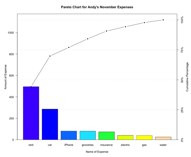
(Above) By default, the pareto.chart() function shows a Pareto analysis and the corresponding chart. Let's add some labels and spice it up!
> pareto.chart(expenses,main="Pareto Chart for Andy's November Expenses",xlab="Name of Expense",ylab="Amount of Expense",las=1,col=topo.colors(8))
Here is a list of the arguments I used and what they mean:
- main: title for Pareto Chart
- xlab: x-axis label
- ylab: y-axis label
- las: orientation of labels on axes (1=horizontal, 2=vertical, 3= perpendicular to axes)
- col=type(length(expenses)): if you don't like the cool tones of topo.colors palette, replace the type with heat.colors for warm tones, terrain.colors for earthy tones, or rainbow for ROYGBIV colors
4. To make it easier for analysis, I added a horizontal line at 80% to see which expenses were problematic for in November.
> abline(h=(sum(expenses)*0.80),col="red",lwd=4)
R calls lines "A-B lines" so we use the abline() function. The h stands for horizontal. This horizontal line is equal to the sum of my expenses multiplied by 0.80. By default, the line width is set to 1 and the color is black but I used the col and lwd arguments for a red colored line and a thicker line width of 4.
5. There's my final product! The major contributors of November's expenses were rent and car! In other words, my rent and car account for the majority of my expenses (80% of problems). Also, I should focus my efforts on these two expenses for the greatest improvement -- note to self: find a place with cheaper rent and/or sell my car for a bicycle!
The Pareto Principle states that about 80% of effects come from 20% of causes. The chart illustrates the small number of causes that account for most of the problems. Remember, the Pareto Chart can only be used when your data are broken into categories with the corresponding frequency of occurrences.


No comments:
Post a Comment